|
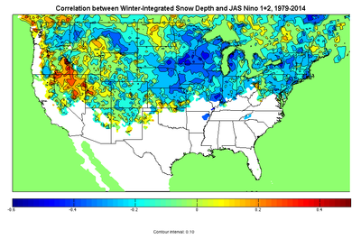
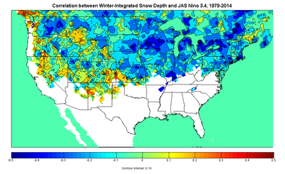
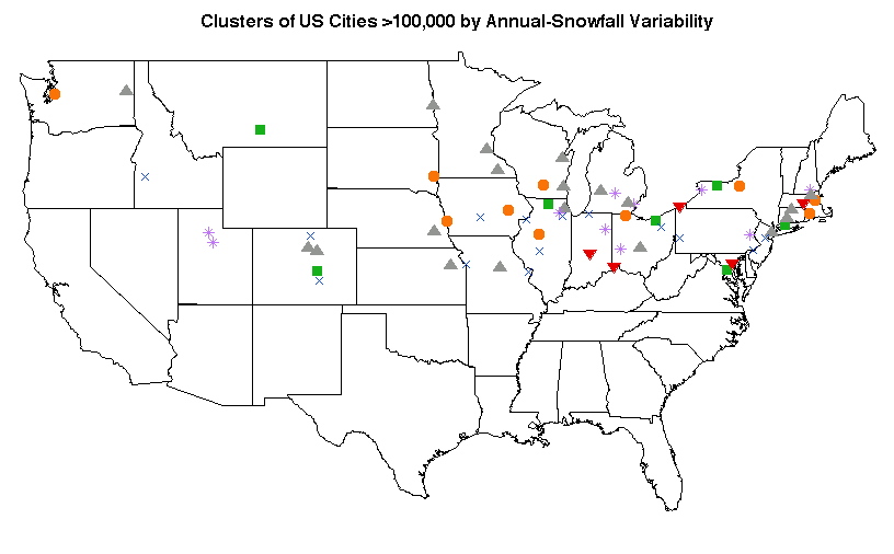
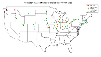
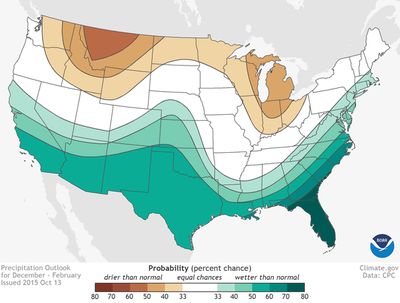
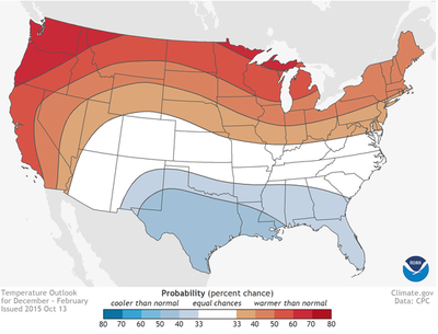
The NOAA Climate Prediction Center released its winter temperature and precipitation outlook recently, and their expectations for generally warm and dry conditions across the northern half of the US, and cool and wet conditions across the southern half, bear the fingerprints of a strong El Niño (the Jul-Aug-Sep sea-surface temperature anomaly in the Niño 3.4 region of the east-central Pacific was the 3rd-highest on record). Recent values of the Arctic Oscillation and North Atlantic Oscillation indices (which tend to track each other) suggest that at least in the early part of the winter, the NAO/AO temperature effects will tend to counterbalance the ENSO-related warming in the northeastern quadrant of the country, while accentuating it in the south-central part. [The AO and NAO are high-latitude patterns of variability, while ENSO is tropical; ENSO's two phases are for historical reasons called El Niño and La Niña.] The negative NAO/positive ENSO combination also means it's likely that the Eastern Seaboard "nor'easter" track will be active. Although these broad temperature and precipitation correlations are well-established, translating them into exact predictions for point locations -- even for seasonal totals -- is notoriously difficult, and that is nowhere more true than with regard to snowfall. NOAA provides the disclaimer: This seasonal outlook does not project where and when snowstorms may hit, or provide total seasonal snowfall accumulations. Snow forecasts are dependent upon the strength and track of winter storms, which are generally not predictable more than a week in advance. However, I was curious to see if the signature of ENSO (as the dominant anticipated modulating effect on the upcoming US winter) could be seen in the observational data for the cities with populations greater than 100,000 that participate in my annual snowfall race. Caveat lector! What is the relationship between the 'snowiness' of a winter and ENSO? In the maps above (click to enlarge), blue (red) areas see less (more) snow on the ground in El Niño years. Winter 2015-16 can best be predicted by some combination of these two images given that JAS SST anomalies were equally strong in Niño 1+2 (east Pacific) and Niño 3.4 (east-central). Integrating snow depth over the entire winter means this measure takes into account both the amount of snow that falls and how long it lasts before melting. Areas with snow cover on fewer than <3% of days are masked out. The correlations are very similar in sign and magnitude for SON and NDJ values as well. The percentage of variability is not terribly high anywhere, but this is of course the predestined fate to which most analyses using observational data are resigned. Still, in El Niño or La Niña years, it means reasonably accurate seasonal snow expectations can be formed as soon as the September ENSO values are out. Looking at seasonal snowfall totals, clustering the cities gives a pretty fractious picture, underlining that the local deviations from the broad expectation can be more important than the expectation itself. For the red cluster, positive ENSO phases are associated with statistically significant greater-than-average snowfall to 95% confidence; for the gray cluster, they're associated with less. Restricting our eyes to the red and gray clusters only, then, reveals something broadly consistent with warm and dry conditions in the northern third of the country, and the faint suggestion of increased snow on the northern side of the southward-displaced storm track through the Ohio Valley and Mid-Atlantic regions. This is based on 65 years of data; another 65 would go a long way toward moving the mass of non-significant points into one camp or the other. Pivoting toward a measure that's more clearly relevant to the coming winter, I also wanted to look at the number of snowstorms in El Niño vs. La Niña years. Just in direct costs these events can be non-negligible chunks of municipal budgets: removal is roughly $0.22 per person per inch in New York City, or $11 per person annually for a city with 50" of snowfall. In the high-snowfall winter of 1977-78 in Illinois, a study used surveys to estimate the total cost associated with snow as about $2.50/person/inch converted to 2015 dollars. A single event can cause something on the order of $20/person in lost productivity, though this is admittedly very rare, and such calculations have been the subject of dispute. I chose 6" as the cutoff because most cities in the race average at least one such storm per year, and it's hard to do statistics on a column that's 90% zeroes. Much like the the previous map, this one uses JAS Niño 3.4 anomalies, and again most correlations are non-significant (click to enlarge figures in the gallery). Somewhat greater spatial coherence is apparent, though, with the Ohio-Indiana-Illinois-Michigan area of reduced snowfall corresponding well to the dry area in the prediction for the coming winter. The main region of statistically significant increased snowfall spans from Cincinnati through Washington and up to Boston, consistent with the area that under El Niño conditions sees near-normal temperatures and normal-to-above-normal moisture. The Front Range cities of Colorado may fall into this category as well but there is not enough data to separate this supposition from the result of the total-snowfall clustering. The takeaway is that if you live between Fargo and Columbus, or in Spokane, you're pretty safe betting your friends it'll be a below-average snowfall year. The Washington-Baltimore area especially should be on the lookout for more snowstorms than usual. Of the whole country, the place where we can have the highest confidence in anything is that Florida will be cool and wet — but no amount of coldness and wetness is going to earn it a place in these snowfall tallies.
0 Comments
|
Archives
September 2023
Categories |
 RSS Feed