|
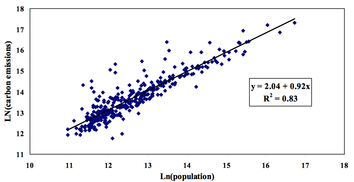
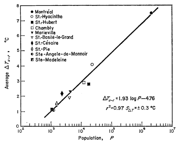
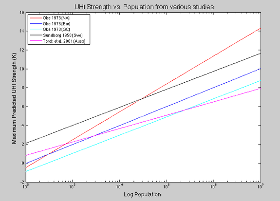
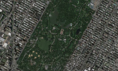
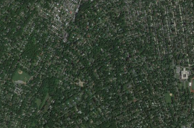
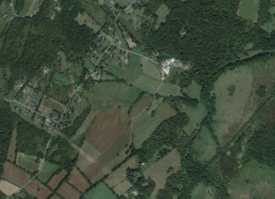
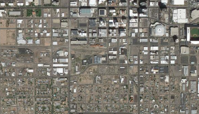
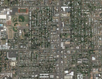
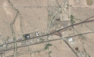
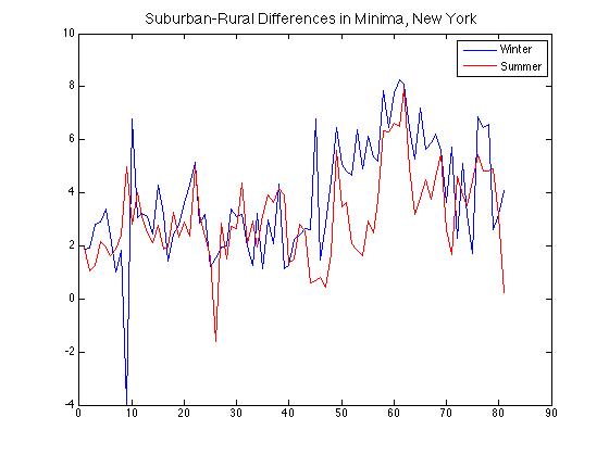
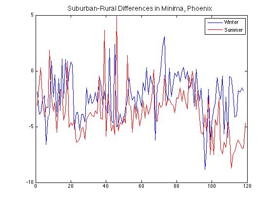
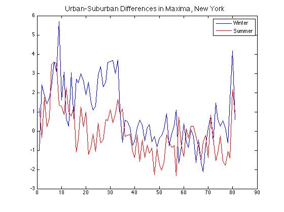
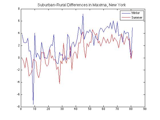
Considering the wild diversity of the world's cities in terms of culture, age, location, density, and many others, it may seem surprising that they in fact follow a good deal of the same principles. A paper called "The Size and Shape of Cities" published in Science a number of years ago made this point well: that everything from population density to the number of tall buildings to apartment rents scales as a well-constrained function of city size. One of that paper's main insights was in observing how urban growth, while an organic phenomenon, follows rules that endow them with certain similarities when viewed in aggregate — much as is true of any life form. As a perceptive and creative (of necessity) early enthusiast of the study of urban climates, Luke Howard would no doubt have been pleased. A salient example of this scaling is in CO2 emissions (which typically correlate closely with total greenhouse-gas emissions, the latter sometimes being converted to units of the former and signified in that case as "tons CO2-equivalent"). To quantify this, researchers took population, economic, and emissions data for all 366 U.S. Census-Bureau-defined metropolitan areas and found a basic log-log relationship (see figure below, at left). Note that the slope of 0.92 being less than 1 indicates greater efficiency in larger cities, as a 1% increase in population correlates with a 0.92% increase in carbon emissions. Replacing population with economic output, the equivalent figure is even lower: 0.79%. For temperatures, the situation is somewhat more complex because both climatic and population influences are at work. Still, it is not terribly so. The classic study of this UHI scaling also found a logarithmic dependence on population in addition to a wind-speed relationship that amounted to differences rapidly decreasing with wind speeds >5 m/s (illustrating its importance in mixing heat). In the evening, when UHIs are typically at their peak intensity, they are consistently present even in settlements of around 1000 people. Even though the UHIs themselves varied significantly from day to day (from 2.5 K to 12.0 K for Montreal, and from 0.2 K to 1.8 K for the village of Ste. Madeleine), the variations all fit within a clear larger picture (see figure above, at right). A more-recent study in Australia found compatible scaling; I combined their estimates with Oke's and those of another seminal early paper to illustrate the range of scaling estimates (see below). These studies found UHI strength peaking in the very center of cities. Speculation about the differences between city scaling laws on the different continents has revolved around land cover, but findings have had caveats. In the Netherlands, a recent study found vegetation a good predictor of UHI intensity, though not if its positive effect on humidity was taken into account. That study also noted a logarithmic dependence of UHI intensity on population density, but with a coefficient that was not especially high. Looking at microclimates more closely has suggested that taller buildings tend to produce higher but more variable street temperatures due to multiple reflections and absorptions of radiation, and this effect is compounded when the buildings are closely spaced (which also minimizes the role of vegetation). More generally, studies have found that the population effect can be captured by considering the characteristic spatial length scale of a city (which can also be expressed as a time for rural air parcels to be affected by urban heat fluxes), with most of the intensity scale-up occurring in the first 15 km of an air parcel's path. Other recent studies have considered in addition such factors as the depth of the mixed layer and the surface heat flux from the city (which through instability helps drive a direct circulation). Overall, the effects of population density and city geometry are not well characterized, but are the subject of active research. Caution must be taken, of course, to avoid excessive generalizations. UHI studies usually focus on the afternoon or evening, when UHI is typically at its strongest (positive) value in moist mid-latitude climates. In another example, the shadowing effect of buildings cools the near-surface air in large and dense cities for an hour or two in the early morning, sometimes creating an inverse UHI. Further, even in the earliest work some allowance had to be made for regional differences -- and this between Europe and eastern North America, both moist mid-latitude climates. And other features like nearby water bodies of course exert an additional confounding influence. Out of curiosity I decided to make some of my own charts and see what information could be gleaned from them. Because high-quality, long-term recording sites separated by small geographic distances are a relative rarity, I looked at four cities in the U.S. that had such sites available: New York, Dallas, Los Angeles, and Phoenix. For each city a representative urban, suburban, and rural site was selected; for New York and Phoenix, the current land cover surrounding each of these sites is shown in the clickable gallery above. Their charts are presented in the slideshow at bottom (with the Phoenix data averaged over 1-year periods, and the others over 10 years; temperatures are in deg F). As this is a blog post I have not corrected certain aspects like the jump in Phoenix urban temperatures near the end of the time series. The absolute dates are not especially important (and are constrained by the availability of data), so each city's charts begin at a different date between 1896 and 1940, and end between 1988 and 2015. Each 'suburban' site saw a transition from rural to suburban (to some degree) over the course of the plotted period. Of particular note is how differences in minima are greater than those for maxima for all four cities. In the top row below are two plots of suburban-rural differences in minima broken down by season for New York and Phoenix, showing the positive UHI in the New York suburbs (here, Scarsdale) but the negative one in Phoenix that has strengthened as its suburbs (here, Mesa) have grown and their associated vegetation has increased relative to the desert beyond. Comparing urban-suburban and suburban-rural differences in maxima for the New York area, in the second row, there is a weak to absent overall pattern for the former but a clear upward trend for the latter. This is likely due to the fact that the area around the Central Park site was already built-up at the beginning of the time series, but the suburbs grew in land-cover intensity, and consequently UHI intensity as well, into the late 20th century -- to the point where the suburbs-countryside difference is as great as the city-suburbs one. Slow population growth and increasing vegetation abundance stalled or reversed this trend in the latter few decades (these time series end in 1990). Finally, note that the UHI is stronger in winter than summer in both cities by about 2 deg F, an amount that varies considerably from year to year. And what trends are in store for the future? A nice essay in the Economist argues that personal wealth is the overriding factor in determining population density, and that suburbs are the urban form (as it were) of the future -- though not necessarily accompanied by the attendant 20th-century-style environmental and social drawbacks with which they are generally associated in the West. Urban areas will of course continue to grow overall, and within them populations will shift from crowded slums to townhouses and towers, lowering the density and also most likely the per-capita contribution to UHI intensity. Per-capita reductions in impact, after all, are the fairest yardstick by which to measure social progress (though environment-focused initiatives like the Kyoto Protocol naturally focus on the total).
0 Comments
UPDATE 2, 5/23/15: This post was originally published on May 7, at which point winter already seemed distant here in New York City (where the last frost was Apr. 1). That was not the case, however, along the Front Range in Colorado, where Boulder and Denver received about 4.0" of additional snowfall on May 9 and 10 — in the case of Boulder, that was enough for it to leapfrog Buffalo and take 4th place. In combination with Salt Lake City's 2nd-least-snowy winter, this also pushed the Denver/SLC snowfall ratio further into record territory (to 3.75). The two cities have nearly identical averages, and the previous range was approximately normally distributed about 1.0 with extrema of 0.33 and 3.15. In addition to Lowell below, several more revisions have also been made, adding or subtracting several tenths of an inch. The most relevant to the standings was Syracuse's gain of 0.1" (from 6.1" to 6.2" on Feb. 19), good for 119.8" total and sole possession of 2nd place. South Bend and Erie also each gained 0.2" via retroactive corrections. The statistics and standings have again been updated accordingly.
UPDATE, 5/18/15: Patrick DeCoursey at the Golden Snow Globe site noted that revisions to the snowfall amounts on two days in March have resulted in Lowell gaining 2.0" and jumping into first place with a new total of 120.6". Such revisions are not altogether rare given the dated procedure in many cities whereby the field observer enters the day's reading by phone as well as jotting it down on paper; in the lull after the winter has passed, the two records are then compared. Patrick explains the details of the Lowell revision here; essentially, he inquired about it and spoke with a National Weather Service meteorologist who confirmed that there had been discrepancies, and that the paper version is treated as the master copy. Other than the remarks on the winners, the below commentary remains valid (and the statistics have been updated).
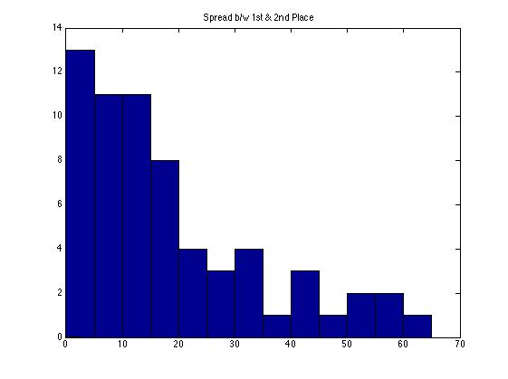
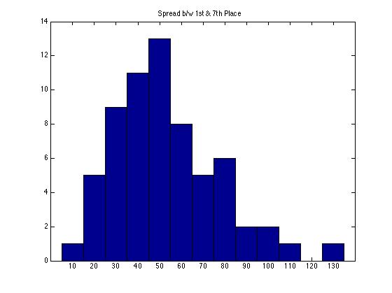
This first year of calculating the snowfall race among U.S. cities with populations >100,000 proved to be an unusually interesting one. From the final update posted on the Recent Weather page, we see there was a tie for first place between Syracuse and Worcester. Going back to the race's start in 1951 (link toward bottom of RW page), when perennial-contender Syracuse's airport weather station came online, a tie for first has never happened. The lefthand figure below shows the distribution of margins of victory over the 64 years from 1951-2014; the previous closest race was decided by 0.5" (between Rochester, NY and Erie, PA in 1999), and many are decided by 15" or more. However, as befitting a race with 64 contestants and finite measurement precision, high-level ties have happened in the past — for example, one for second between Anchorage and Syracuse in 2008. In the righthand figure, we see that the spread between 1st and 7th places this year was also the narrowest on record, with only 10.0" separating Lowell from Boston, versus the prior minimum of 13.6" (the intermediate spreads were record-setting as well). Despite finishing 6th, 7th, and 8th respectively, Erie, Boston, and Rochester NY can take solace in the fact that they finished with the most snow of any cities in those places in the history of the race.
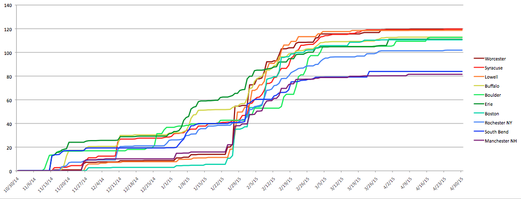
Speaking of Anchorage, it was a complete no-show in this year's race. With only 25.1" against an average of 74", Anchorage set a record for least snowfall, as did Provo, UT which received just 21% of its usual 53.6". These observations fit the overall pattern of a low-snow winter in the West and Midwest except along the Front Range in Colorado (see map below). Snowfall amounts were mixed but generally near average across the Great Lakes snowbelt, while the third major region, the Northeast Corridor, saw heavy snow due to a series of (well-publicized) storms in its northern half in late January and February. This can be seen in the chart below the map. What stands out there is how the cities in the lead at any given point are rarely the ones making the news; for instance, Buffalo trailed or was neck-and-neck with Erie throughout November and December, while aside from the major Northeastern storm in late January that brought Massachusetts and New Hampshire into the running, the subsequent storms piled up snow no faster than did lake-effect events in the Great Lakes. Perhaps it is possible to devise a formula to estimate media attention as a function of population affected and abnormality of the conditions, rather than their absolute magnitude. Worcester's 119.7" was nearly double its average and good for 2nd all-time, and Boston's 110.6" was a record (as was Lowell's 120.6" and Providence's 76.2"); meanwhile, Syracuse's 119.8" was a notch below its average of 122".
View US Cities >100,000 2014-15 Snowfall Rankings in a full screen map
Besides the closeness, this year's iteration was notable as a departure from typical regional patterns. In this, it was a sharp contrast from recent years. In 2011 and 2014 the Great Lakes snowbelt cities ran away with the contest (particularly Syracuse in 2011, with a margin of victory over 50"). 2013 saw a relatively close race with Boulder, Syracuse, and Worcester finishing 1-2-3, and in 2012 persistent warmth in the East led to a low-scoring grudge match for third place behind Anchorage and Boulder. Many cities saw record or near-record lows that winter, including Boston at just 9.3". 2015 was unusual in that it had in Lowell the first champion from the Northeast Corridor. Indeed, a Northeast city has placed even second only four times previously, with Worcester carrying the flag in each case. Most other years the Great Lakes snowbelt has dominated the top three positions, occasionally with Western cities nudging their way to the top. Only twice in 65 years have the Great Lakes been shut out of the top three entirely: 1983 (Provo-Minneapolis-Anchorage) and 1995 (Anchorage-Boulder-Salt Lake City). This year's storms being centered on New England resulted in a much larger differential across the Northeast Corridor than usual: climatologically Boston receives 44" and Philadelphia 22"; this year those figures were 110.6" and 27.0". These storms doubtless also helped Mt. Washington vault into first place in the all-station race (also on the Recent Weather page), which is typically dominated by big Western ski resorts — many of which struggled to match even hills downwind of Lakes Superior, Erie, and Ontario. While the U.S. is certainly capable of large seasonal-snowfall totals (witness the world-record 1,140" received at Mt. Baker, WA in 1998-99), this year the international crown is ceded, at least in the universe of sites with daily manual measurement, to the resorts of Mt. Myoko in Japan.
|
Archives
September 2023
Categories |
 RSS Feed