|
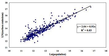
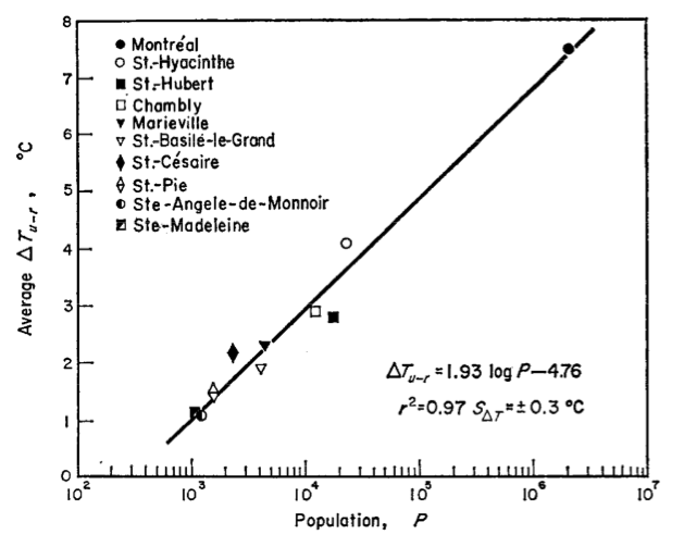
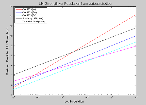
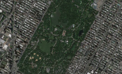
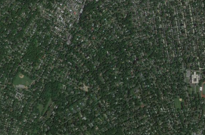
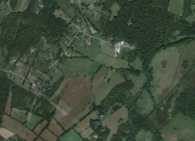
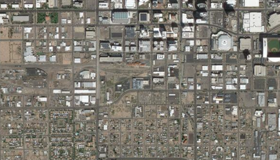
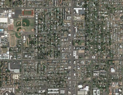
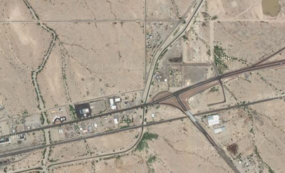
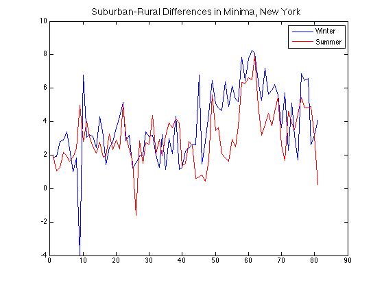
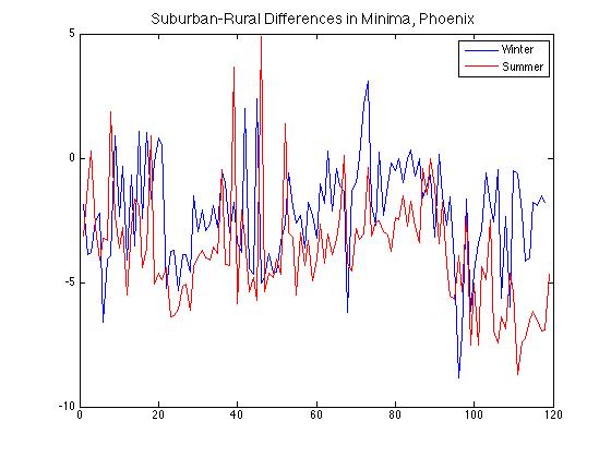
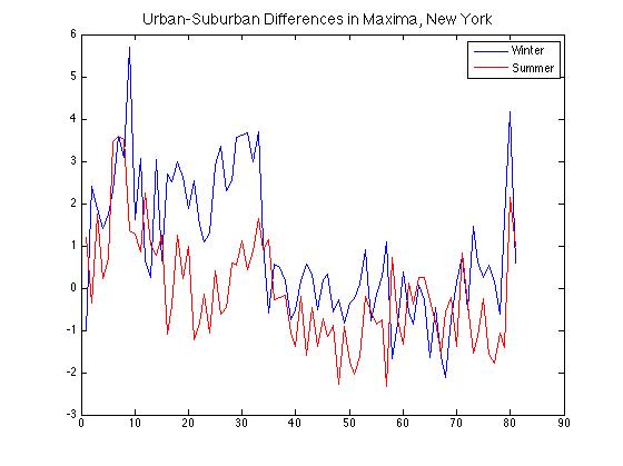
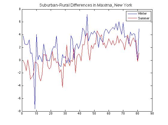
Considering the wild diversity of the world's cities in terms of culture, age, location, density, and many others, it may seem surprising that they in fact follow a good deal of the same principles. A paper called "The Size and Shape of Cities" published in Science a number of years ago made this point well: that everything from population density to the number of tall buildings to apartment rents scales as a well-constrained function of city size. One of that paper's main insights was in observing how urban growth, while an organic phenomenon, follows rules that endow them with certain similarities when viewed in aggregate — much as is true of any life form. As a perceptive and creative (of necessity) early enthusiast of the study of urban climates, Luke Howard would no doubt have been pleased. A salient example of this scaling is in CO2 emissions (which typically correlate closely with total greenhouse-gas emissions, the latter sometimes being converted to units of the former and signified in that case as "tons CO2-equivalent"). To quantify this, researchers took population, economic, and emissions data for all 366 U.S. Census-Bureau-defined metropolitan areas and found a basic log-log relationship (see figure below, at left). Note that the slope of 0.92 being less than 1 indicates greater efficiency in larger cities, as a 1% increase in population correlates with a 0.92% increase in carbon emissions. Replacing population with economic output, the equivalent figure is even lower: 0.79%. For temperatures, the situation is somewhat more complex because both climatic and population influences are at work. Still, it is not terribly so. The classic study of this UHI scaling also found a logarithmic dependence on population in addition to a wind-speed relationship that amounted to differences rapidly decreasing with wind speeds >5 m/s (illustrating its importance in mixing heat). In the evening, when UHIs are typically at their peak intensity, they are consistently present even in settlements of around 1000 people. Even though the UHIs themselves varied significantly from day to day (from 2.5 K to 12.0 K for Montreal, and from 0.2 K to 1.8 K for the village of Ste. Madeleine), the variations all fit within a clear larger picture (see figure above, at right). A more-recent study in Australia found compatible scaling; I combined their estimates with Oke's and those of another seminal early paper to illustrate the range of scaling estimates (see below). These studies found UHI strength peaking in the very center of cities. Speculation about the differences between city scaling laws on the different continents has revolved around land cover, but findings have had caveats. In the Netherlands, a recent study found vegetation a good predictor of UHI intensity, though not if its positive effect on humidity was taken into account. That study also noted a logarithmic dependence of UHI intensity on population density, but with a coefficient that was not especially high. Looking at microclimates more closely has suggested that taller buildings tend to produce higher but more variable street temperatures due to multiple reflections and absorptions of radiation, and this effect is compounded when the buildings are closely spaced (which also minimizes the role of vegetation). More generally, studies have found that the population effect can be captured by considering the characteristic spatial length scale of a city (which can also be expressed as a time for rural air parcels to be affected by urban heat fluxes), with most of the intensity scale-up occurring in the first 15 km of an air parcel's path. Other recent studies have considered in addition such factors as the depth of the mixed layer and the surface heat flux from the city (which through instability helps drive a direct circulation). Overall, the effects of population density and city geometry are not well characterized, but are the subject of active research. Caution must be taken, of course, to avoid excessive generalizations. UHI studies usually focus on the afternoon or evening, when UHI is typically at its strongest (positive) value in moist mid-latitude climates. In another example, the shadowing effect of buildings cools the near-surface air in large and dense cities for an hour or two in the early morning, sometimes creating an inverse UHI. Further, even in the earliest work some allowance had to be made for regional differences -- and this between Europe and eastern North America, both moist mid-latitude climates. And other features like nearby water bodies of course exert an additional confounding influence. Out of curiosity I decided to make some of my own charts and see what information could be gleaned from them. Because high-quality, long-term recording sites separated by small geographic distances are a relative rarity, I looked at four cities in the U.S. that had such sites available: New York, Dallas, Los Angeles, and Phoenix. For each city a representative urban, suburban, and rural site was selected; for New York and Phoenix, the current land cover surrounding each of these sites is shown in the clickable gallery above. Their charts are presented in the slideshow at bottom (with the Phoenix data averaged over 1-year periods, and the others over 10 years; temperatures are in deg F). As this is a blog post I have not corrected certain aspects like the jump in Phoenix urban temperatures near the end of the time series. The absolute dates are not especially important (and are constrained by the availability of data), so each city's charts begin at a different date between 1896 and 1940, and end between 1988 and 2015. Each 'suburban' site saw a transition from rural to suburban (to some degree) over the course of the plotted period. Of particular note is how differences in minima are greater than those for maxima for all four cities. In the top row below are two plots of suburban-rural differences in minima broken down by season for New York and Phoenix, showing the positive UHI in the New York suburbs (here, Scarsdale) but the negative one in Phoenix that has strengthened as its suburbs (here, Mesa) have grown and their associated vegetation has increased relative to the desert beyond. Comparing urban-suburban and suburban-rural differences in maxima for the New York area, in the second row, there is a weak to absent overall pattern for the former but a clear upward trend for the latter. This is likely due to the fact that the area around the Central Park site was already built-up at the beginning of the time series, but the suburbs grew in land-cover intensity, and consequently UHI intensity as well, into the late 20th century -- to the point where the suburbs-countryside difference is as great as the city-suburbs one. Slow population growth and increasing vegetation abundance stalled or reversed this trend in the latter few decades (these time series end in 1990). Finally, note that the UHI is stronger in winter than summer in both cities by about 2 deg F, an amount that varies considerably from year to year. And what trends are in store for the future? A nice essay in the Economist argues that personal wealth is the overriding factor in determining population density, and that suburbs are the urban form (as it were) of the future -- though not necessarily accompanied by the attendant 20th-century-style environmental and social drawbacks with which they are generally associated in the West. Urban areas will of course continue to grow overall, and within them populations will shift from crowded slums to townhouses and towers, lowering the density and also most likely the per-capita contribution to UHI intensity. Per-capita reductions in impact, after all, are the fairest yardstick by which to measure social progress (though environment-focused initiatives like the Kyoto Protocol naturally focus on the total).
0 Comments
Leave a Reply. |
Archives
September 2023
Categories |
 RSS Feed