|
We all know from basic human experience that the thermometer alone is hardly a complete description of how outside conditions feel at any given moment. The summer sun may be beating down and the air thick with moisture, or a stiff breeze may make a winter's day much harsher than the temperature would suggest. These differences in comfort level can be applied equally to climate as to weather -- for instance, the moist tropical parts of the world are generally perceived as 'hotter' than the dry subtropics even though the latter have the higher temperatures. The combined effect of heat and humidity can be captured in a term called equivalent temperature. Yet there is no universal variable that also takes into account wind speed, solar radiation, and so on. Partly this is for reasons of convenience: data for solar radiation and wind gusts, among others, are rarely saved at weather stations. Various metrics have been derived, some of them proprietary, each with their own advantages and limitations: the AccuWeather 'RealFeel' temperature (with a large number of variables taken from weather models, plus a fuzzy 'perception' factor), the National Weather Service heat index and wind chill, Environment Canada wind chill, the wet-bulb globe temperature, and so on. These are loosely based on physiological studies (e.g. of the amount of caloric expenditure required to maintain homeostasis under a particular set of conditions), with some degree of fudging based on the developer's personal opinions of what constitutes uncomfortable vs. comfortable. In climatology, the wet-bulb temperature is frequently used on the hot end because it can be closely approximated knowing just temperature plus relative humidity or dewpoint.
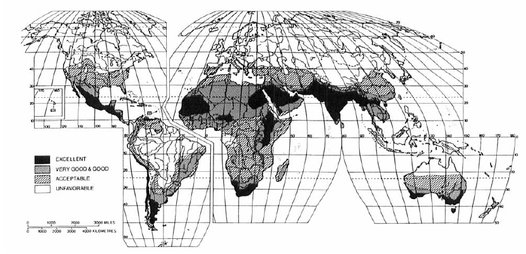
Intercomparisons between indices have been limited, particularly considering their importance in representing (or at least attempting to represent) the perception of a region's climate to its inhabitants. One effort, now 30 years old, is the "tourism climatic index" (see figure below), taking into account daily-average temperature, humidity, sunshine, precipitation, and wind. While a physiological justification is provided for the inclusion of each variable, the existence of a section called "the issue of the arbitrariness of weights" is reason enough to take any one index with a grain of salt.
My aim was to develop a comfort score that 1. encapsulated key variables (temperature, humidity, and wind), 2. could be calculated from reanalysis datasets to make a gridded product, 3. was simple enough to be computed often, so month-by-month updates could be provided, and 4. reflected common perceptions (in my judgment) of the relative difference in comfort from place to place and time to time. The source dataset is a six-hourly reanalysis, meaning observations are fed into a model that smoothes and interpolates them onto a nice grid. For hot temperatures I used the NWS heat-index formula, and for cold temperatures the NWS wind-chill formula. I defined the optimal adjusted-temperature window as 70 F to 80 F, assigning 'discomfort' weights outside this window based on a modified version of the Anderson and Bell 2009 curve shown in their Figure 2. I compensated for the shifted optimal temperatures by increasing the weight of hot temperatures, and therefore effectively the steepness of the curve above 80 F. My final formula makes equivalent, in comfort terms, a heat index of 90 F and a wind chill of 40 F; a heat index of 100 F and a wind chill of 10 F; and so on.
Once the comfort scores were defined, I calculated climatologies for each month and season across the contiguous US, as well as for each city with a population >100,000 (by triangulating from the nearest three grid points). Annual and seasonal climatology plots are shown in the clickable slideshow below (note the differing scales between plots). The actual values are not important, only how large they are relative to one another. Blues correspond to greater comfort (warmer conditions when it's typically cold, or cooler conditions when it's typically hot), with reds indicating more-intense or -numerous extremes. Temperature is the primary driver, though for example a windier cold snap or a more-humid heat wave could cause a 'red shift' at a location as well.
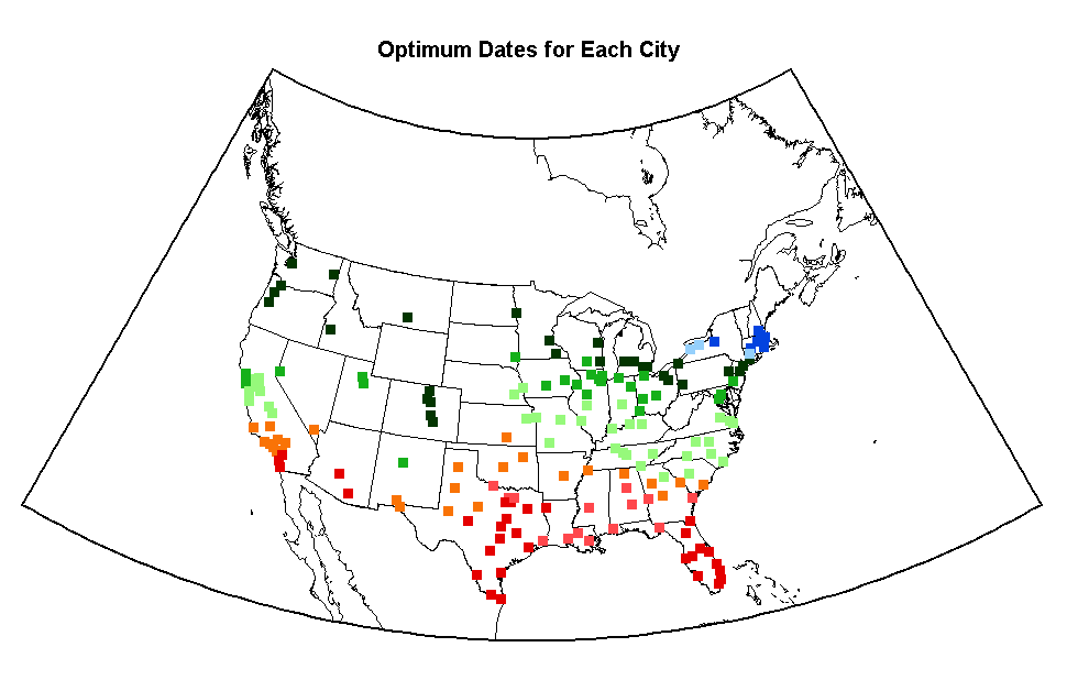
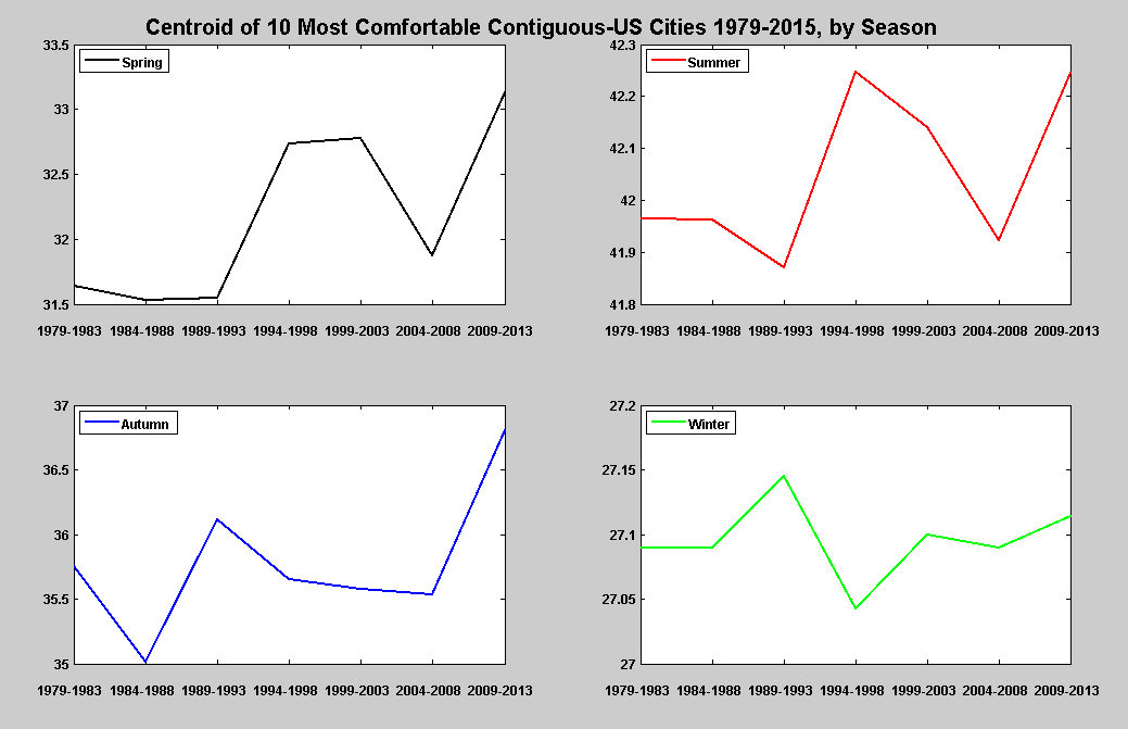
Another question to investigate concerned the most-comfortable cities (which can be guessed at by examining the above plots). I was curious how these changed from season to season, and if there were significant differences from year to year. The short answer is that, as circuses and state fairs already know (comparing the optimum dates for each city and the dates of the state fairs in the top two figures below show fairly good agreement, indicating that these comfort scores represent roughly what event planners have already taken into consideration), in winter the Gulf Coast is most comfortable, moving up to the Great Lakes & Northeast by June and remaining there through September, then rapidly moving back to the Deep South (4th figure). The most uncomfortable cities (5th figure) in the spring, summer, and fall are in the humid Deep South, moving up to the windy Great Plains/northern Rockies in early winter and over to the Great Lakes in late winter. There is slight variation around these averages on a decadal basis (middle figure), with a warming trend apparent in spring and autumn but not so much in summer or winter. Partly of course this is because there are a limited number of cities used, they are unevenly spaced, weather dominates over climate on short timescales, etc.
But even with these caveats, the numbers match up well with prior expectations: the northward movement of the most-comfortable cities since 1980 has been about 1.5 deg latitude in spring, 0.3 in summer, 1.1 in autumn, and 0 in winter, for an average of 0.73 deg lat. U.S. average temperature has increased about 1.5 deg F during that period; as annual-average temperature in the US drops about 32 F in 20 deg lat, or 1.6 F/lat, all other things being equal the most-comfortable locations should have shifted northward 0.95 deg lat. Not too far off!! In fact, in a post last December about the related "habitability shift", I noted studies that found flora and fauna globally were moving poleward something like 1.7 km/year, which amounts to 60 km or 0.55 deg lat over 35 years. All together, at face value, these numbers suggest raw temperatures are rising fastest, with (for various unexplored reasons) locations of maximal comfort moving somewhat slower, and flora and fauna logically moving slowest of all. 
In this figure and the state-fair one above, the colors are as follows: dark red: late Nov-late Mar --- light red: early Apr/early Nov --- orange: late Apr/late Oct --- light green: early May/early Oct --- green: late May/late Sep --- dark green: early Jun/early Sep --- light blue: late Jun/late Aug --- dark blue: early Jul/early Aug --- dark blue: late Jul
0 Comments
Leave a Reply. |
Archives
September 2023
Categories |


 RSS Feed